The Molecular Weight Cut-Off (MWCO) curve is not just a specification—it’s the blueprint of a membrane’s selectivity. In configuring a chemical engineering pilot plant, its significance lies in revealing exactly how a membrane separates molecules of different sizes. By plotting the rejection rate against solute molecular weight, you obtain a characteristic S-shaped curve. The steepness of this curve directly quantifies the uniformity of the membrane’s pores: a sharp curve signals high resolution and the ability to cleanly split molecules of similar size, while a diffuse curve warns of a broad pore-size distribution that will blur separation boundaries and degrade product purity.
A membrane’s MWCO curve—the plot of solute rejection versus molecular weight—is the ultimate diagnostic tool for pilot plant work. Its steepness defines separation resolution: a sharp curve signals a narrow pore size distribution for clean, high-purity separations, while a diffuse curve indicates variable pore sizes and poor selectivity. Ignoring the curve’s shape can lead to failed scale-up and misinterpreted data.
Why the MWCO Curve is Your Most Critical Pilot Plant Metric
The curve serves as a fingerprint of the membrane’s internal pore structure. It does more than identify the molecular weight at which rejection hits 90% (the nominal MWCO). It reveals the entire distribution of pore sizes, which ultimately governs separation efficiency, product yield, and the reproducibility of your pilot results.
From Specification Sheet to Real Selectivity
Manufacturers often quote a single MWCO value, but that number is meaningless without the curve that surrounds it. Two membranes with an MWCO of 400 Da can behave entirely differently. One might reject 99% of 400 Da solutes and only 10% of 300 Da solutes—ideal for a clean catalyst split. The other might show only 70% rejection at 400 Da and still hold back 30% of 300 Da molecules, leading to frustrating overlap and a purity that never meets target.
Direct Link to Pore Size Distribution
The shape of the curve is a visual proxy for pore size distribution. A steep curve corresponds to a narrow, uniform pore population; virtually all pores are the same size, so the cut-off is sharp. A gradual, sprawling curve reflects a broad spread of pore diameters. That variability means some pores will let oversized molecules slip through, while smaller pores retain solutes that should ideally pass—a situation that creates unpredictable process performance.
Decoding the Steepness: Sharp vs. Diffuse Curves
The Sharp Curve: Precision Separation
When the rejection jumps from near-zero to near-total over a small molecular weight range, you have a sharp, narrow-pore-distribution membrane. This is the gold standard for high-resolution separations.
In a pilot plant, a sharp-curve membrane allows you to concentrate or purify a target solute with confidence. For example, in a catalyst recovery experiment, a membrane with a sharp curve around 400–500 Da will retain the catalyst (>90% rejection) while allowing a reaction product of 300 Da to pass freely. There is minimal loss of product in the retentate and minimal catalyst contamination in the permeate. The data you collect will be clean, the mass balances will close, and scale‑up predictions will be far more reliable.
The Diffuse Curve: Uncertainty and Overlap
A diffuse curve rises slowly, often starting to reject solutes far below the nominal MWCO and never reaching complete rejection even for molecules well above it. This shape signals a wide distribution of pore sizes.
On the pilot scale, this can be disastrous. Suppose you intend to separate a desirable 200 Da flavonoid from a 500 Da impurity. A diffuse-curve membrane might partially reject the flavonoid (lowering yield) while partially passing the impurity (compromising purity). The result is a murky separation that demands additional downstream polishing. Moreover, every experiment becomes sensitive to minor fluctuations in pressure, concentration, and fouling, making the process difficult to control and scale.
Generating the MWCO Curve in a Pilot Plant
The curve is not just a manufacturer’s ideal—it is something you can, and should, experimentally validate on your pilot unit.
Working with Standard Marker Molecules
Choose a set of non‑interactive marker solutes with well‑known molecular weights that span the range of your separation. For ultrafiltration, glucose (180 Da), cytochrome C (12.4 kDa), myoglobin (17 kDa), and albumin (66 kDa) are typical. For organic solvent nanofiltration (OSN) in the 200–1000 g/mol range, tailored standards such as linear polystyrene oligomers or polyethylene glycols are more appropriate. Dissolve them in your actual process fluid (because solvent interactions can shift the curve significantly) and run the pilot plant at controlled conditions.
Plotting the Curve
Collect permeate and feed samples and measure the concentration of each marker. Calculate the rejection rate \(R\) for each solute:
\[ R = 1 - \frac{c_p}{c_f} \]
where \(c_p\) is the permeate concentration and \(c_f\) is the feed concentration. Plot \(R\) (0 to 1) against the logarithm of molecular weight. The characteristic S‑shape will emerge. The molecular weight where \(R = 0.9\) is your experimentally determined MWCO, and the steepness of the transition tells you everything about the pore-size uniformity.
From Curve to Configuration: Choosing the Right Membrane
Once you have the rejection curve—either from qualification or from published data—you can match it directly to the process goal.
Precision Pharmaceutical Separations
For high‑value separations such as homogeneous catalyst recovery or solvent exchange in active pharmaceutical ingredient (API) synthesis, you need a low MWCO membrane with an exceptionally sharp curve. A membrane in the 150–300 g/mol range that shows a near-vertical rejection transition will provide high retention of the catalyst and clean permeation of the product. The trade‑off is usually lower flux, but the purity gain justifies it.
Higher‑Throughput Food or Bulk Applications
When processing streams such as vegetable oil deacidification, some overlap between solute sizes may be acceptable, and productivity often takes priority. Here, a membrane with a slightly higher MWCO (200–300 g/mol) and a moderately steep curve can deliver acceptable selectivity while offering significantly higher throughput. The curve still helps you quantify the expected bleed of impurities—so you can make a data‑driven bet on whether downstream polishing steps are needed.
Training and Educational Setups
For a university pilot plant, the ability to swap membrane modules and measure the resulting curve is an invaluable teaching tool. Students can feed a standard marker mixture, generate the S‑curve for different membranes, and directly observe how pore-size distribution translates into separation performance. This experiential link between theory and practice cements understanding far better than a textbook diagram ever could.
Understanding the Trade-offs and Practical Pitfalls
Even the most elegant MWCO curve cannot be interpreted in isolation.
Selectivity vs. Permeability
Membranes with the sharpest curves often possess a tighter, more uniform pore network that inherently restricts flow. A 150–300 g/mol membrane may show a pristine step-change in rejection, but its pure‑water flux can be half that of a diffuse-curve competitor with the same nominal MWCO. The pilot plant must balance separation quality against the membrane area and pumping costs.
Solvent and Solute Interactions
The MWCO curve is typically calibrated in water with inert markers like dextrans or polyethylene glycol. In organic solvents (OSN), membrane swelling or solute-solvent interactions can shift the effective pore size, altering both the MWCO and the curve shape. Always generate or verify the curve in the actual process solvent; otherwise, your pilot data will be misleading.
Fouling and Curve Degradation
A pilot plant is a dynamic environment. Over time, concentration polarization, cake formation, and pore plugging can distort the effective rejection curve. The sharp S‑shape may flatten, and the apparent MWCO can drift upward, signaling that foulants have widened the pore-size distribution. Monitoring the curve periodically with a marker test allows you to schedule clean‑in‑place cycles before product quality is compromised.
Module Configuration Counts
The module type you choose affects how faithfully you can measure and exploit the MWCO curve. For feeds with suspended solids, capillary‑fiber modules permit bore‑side feeding and backflushing, preventing fouling that would flatten the curve during a run. Spiral‑wound modules, while robust for clean feed reverse osmosis, are less forgiving of particulates and can produce distorted rejection data if gels build up on the spacer. Match the module to the feed to preserve the membrane’s native curve.
How to Apply This Insight to Your Pilot Plant Experiments
- If your primary focus is high‑purity separation: Prioritize membranes with a steep rejection curve, even if that demands a lower nominal MWCO and lower flux. The sharp transition will minimize cross‑contamination.
- If your primary focus is maximum throughput with acceptable purity: Evaluate membranes with a slightly more gradual curve but higher permeability. Plot the curve using your real feedstock to quantify the exact impurity break‑through you must tolerate.
- If you are training students or validating a new process: Generate the full S‑curve with a panel of marker molecules for each candidate membrane. Teach them to interpret the steepness as a direct read‑out of pore‑size uniformity, linking that to process robustness.
- If your pilot plant handles fouling‑heavy streams: Re‑measure the curve periodically during a run. A flattening curve is an early warning of fouling, telling you exactly when to trigger a cleaning cycle to restore separation integrity.
The MWCO curve transforms membrane selection from a guess into a data‑driven decision, giving you the clarity to match a membrane’s true selectivity profile to your exact process demands and to troubleshoot deviations before they cascade into process failure.
Summary Table:
| Curve Type | Pore Size Distribution | Ideal Application | Key Pilot Plant Benefit |
|---|---|---|---|
| Sharp Curve | Narrow & uniform | High-purity APIs, catalyst recovery | High selectivity, predictable scale-up |
| Diffuse Curve | Wide & variable | Food/bulk processing, high throughput | Higher flux, requires downstream polishing |
Optimize Your Membrane Filtration Processes with LABPARK
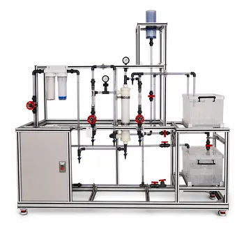
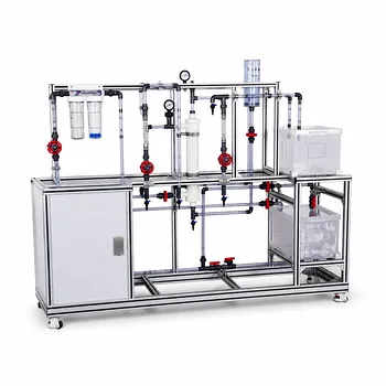
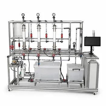
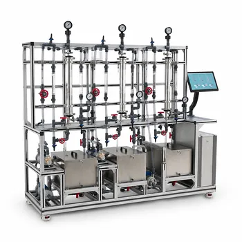
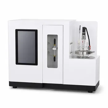
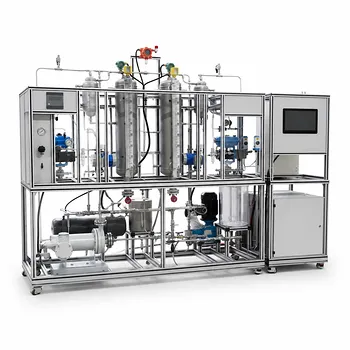
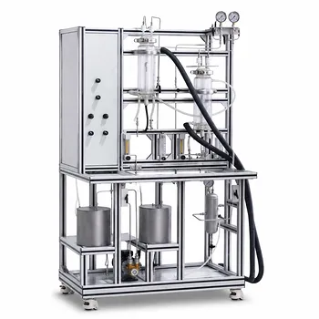
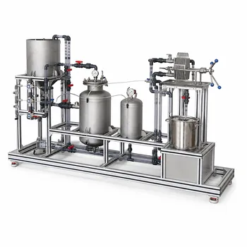
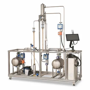
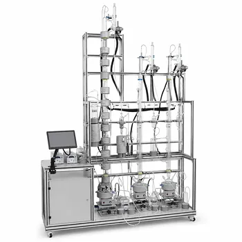
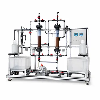
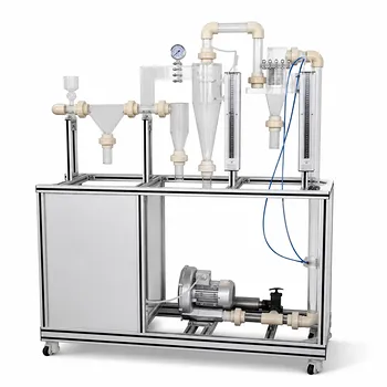
Are you looking to bridge the gap between membrane theory and practical application in your facility? LABPARK provides state-of-the-art Educational and Vocational Unit Operations Pilot Plants in chemical engineering, bioprocess & biotech, and environmental & water treatment. Designed specifically for universities, research institutes, and enterprises, our pilot plants empower you to validate MWCO curves, test membrane configurations, and ensure seamless scale-up.
Contact LABPARK today to find the perfect pilot plant for your needs!
Related Products
- Ultrafiltration Membrane Separation Educational Pilot Plant
- Hollow Fiber Ultrafiltration Membrane Separation Educational Pilot Plant
- Multifunctional Membrane Separation Educational Pilot Plant with Ultrafiltration, Nanofiltration, Reverse Osmosis
- Multi-Functional Membrane Separation Educational Pilot Plant for Unit Operations Lab
- Multi Functional Membrane Crystallization Educational Unit Operations Pilot Plant
People Also Ask
- How do PEI, PVDF, and PSU membranes compare in pilot plants? Find the best fit.
- Pervaporation vs. Vapor Permeation: Handling Suspended Solids in Membrane Pilot Plants
- Why Use a Membrane Separation Pilot Plant vs. Lab Testing? Avoid Costly Scale-Up Failures
- Isotropic vs. Anisotropic Membranes: How to Choose the Best Pilot Plant Modules
- How do membrane pilot plants demonstrate synthetic vs biological membrane advantages?