In a chemical engineering or bioprocess pilot plant, the gap between a successful run and an unexpected failure often hides in plain sight—across dozens of correlated sensor readings. Principal Component Analysis (PCA) compresses this complex, high-dimensional data into a few uncorrelated summary indices called principal components. When you then plot new real-time samples on a simple two-dimensional chart and overlay the Hotelling (T^2) ellipse at a 95% (or 99%) confidence limit, any point falling outside that ellipse signals a statistically significant deviation. This immediately alerts operators to equipment malfunctions, feed quality shifts, or emerging process instability well before the run is lost.
Pilot plants generate massive, intercorrelated data that individual trend charts cannot reliably interpret. PCA builds a low-dimensional “normal operating” space, and the Hotelling (T^2) ellipse acts as a real‑time multivariate alarm—turning pattern recognition into an early warning system for process anomalies.
The Unseen Complexity of Pilot Plant Data
Correlated Variables Mask Faults
In a pilot-scale distillation column, for example, you might have five temperature sensors along the column and a pressure gauge. These readings are not independent; a change in bottom temperature ripples upward. Monitoring each sensor on its own control chart risks missing the pattern that indicates a developing flood or tray damage.
The same holds in bioprocesses: pH, dissolved oxygen, and metabolite concentrations all move together as cells grow. A univariate alert would fire only when one parameter crosses a hard limit—often too late.
Why Univariate Charts Fail
When you set individual limits for each variable, you create a rectangular acceptance region. But in a multivariable process, the true normal operating region is elliptical due to correlation. A point can be within every univariate limit yet still represent a highly abnormal combination of settings—for instance, high temperature with low flow that never occurred in historical normal batches. PCA collapses this cloud of correlated variables into an orthogonal score space where normal operation is compact and clearly defined.
How PCA Creates a Stable Operating Envelope
Dimensionality Reduction and Orthogonalization
PCA uses historical normal operating data (often called “golden batch” data) to find the directions of maximum variance. The first principal component (PC1) captures the largest spread in the data, PC2 the next largest orthogonal to PC1, and so on. In most pilot-plant unit operations, two or three PCs explain 80 %–95 % of the total variation, transforming perhaps fifty sensor channels into a manageable score plot.
This compression also eliminates collinearity. High correlation between multiple temperature readings or between spectral wavelengths would break a classical regression; PCA replaces them with uncorrelated score variables, making downstream models stable and noise‑filtered.
Building the PCA Model from Historical Batches
The model is built exclusively from periods of confirmed, optimal operation. After mean‑centering and scaling each variable (so that a pressure of 1 bar doesn’t dominate a temperature of 300 K), the PCA algorithm computes the loading vectors that define the reduced space. Once the model is locked, any new process sample can be projected onto it, yielding its scores (its position in the PC plane) and the residuals—the information the model could not explain.
The Hotelling (T^2) Ellipse as a Real‑Time Alarm
What the (T^2) Statistic Measures
The Hotelling (T^2) statistic is a squared Mahalanobis distance within the PCA score space. It measures how far a new point lies from the centroid of the normal operating region, weighted by the covariance of the calibration data. At a 95 % confidence level, the (T^2) limit traces an ellipse (or ellipsoid in three dimensions) around the normal scores. If a real‑time sample projects outside this ellipse, it indicates that the combination of process variables is statistically different from anything seen during normal operation—an anomaly.
Interpreting a Point Outside the Ellipse
A point breaching the ellipse is not proof of a specific fault, but it is a strong statistical signal that the process has departed from its normal correlation structure. In a bioprocess perfusion loop, such a deviation might be caused by a sudden temperature mismatch, a fouled sensor, or a shift in feed composition. The key benefit is that the operator is warned when the process is still recoverable, not after a final quality deviation has occurred.
The Q Statistic: Catching Unexplained Variation
While (T^2) monitors the magnitude inside the model space, the Q statistic (also called Squared Prediction Error, SPE) measures the part of the new measurement that the PCA model does not capture. A simultaneously high Q value tells you that a new kind of variation—perhaps a sensor failure or a contaminant that wasn’t present in the training set—has appeared. Monitoring both (T^2) and Q with their respective confidence limits gives a complete picture of process health.
Implementing Multivariate Monitoring in a Pilot Plant
From Spectral PAT to Score Plots
Modern pilot plants increasingly rely on Process Analytical Technology (PAT) sensors—such as NIR or Raman spectrometers—that generate hundreds of wavelengths per sample. If you tried to feed all those variables into a traditional univariate chart, the noise would overwhelm you. PCA compresses that spectral fingerprint down to a few scores, allowing you to monitor reaction progress, detect contamination, or follow granulation densification on a single, intuitive screen.
For batch monitoring, you can build a model from past successful batches and watch as the trajectory of a new batch develops through the score space. A deviation from the reference trajectory flags the batch early, enabling mid‑course corrections instead of end‑of‑run disappointment.
Variable Contribution Plots Pinpoint Root Causes
When a (T^2) or Q alarm fires, the natural next question is “What caused it?”. That’s where contribution plots become invaluable. By decomposing the high statistic into the contributions of each original variable, you can immediately see which sensor—say, the feed pump flow rate or the cooling jacket inlet temperature—is pulling the point outside the ellipse. This guides the operator to the physical root cause in seconds, something impossible if you were staring at twenty separate trend lines.
Understanding the Trade‑offs
Model Robustness and Data Drift
A PCA monitoring model is only as good as the data it was trained on. If the raw materials or equipment slowly change over months (e.g., catalyst deactivation or seasonal ambient temperature shifts), the historical normal region may no longer represent “normal.” The model must be periodically updated, or else it will generate false alarms. Plan for a re‑calibration schedule.
The Danger of Overlooking the Q Statistic
It is tempting to look only at the (T^2) ellipse because it appears on a familiar 2D chart. But a process can have a perfectly acceptable (T^2) value while exhibiting a large Q spike—think of a new impurity that doesn’t project into the normal PC space. Relying on (T^2) alone will miss this fault, so you must monitor both metrics.
Training Data Must Represent Normal Operation
If the historical dataset includes hidden abnormalities or run‑to‑run shifts that were never flagged, those will be incorporated into “normal.” The ellipse then widens and loses sensitivity. Meticulous selection of truly golden batches is essential.
Confidence Level vs. Sensitivity
A 95 % ellipse is the standard, but it means that 5 % of normal points will statistically fall outside by random chance. Setting a 99 % limit reduces false alarms but may also delay detection of a real drift. The choice should reflect the cost of a false alarm versus the cost of a missed fault in your particular pilot operation.
Making the Right Choice for Your Pilot‑Plant Goal
The application of PCA and Hotelling (T^2) should be tailored to what you most need to achieve.
- If your primary focus is early‑fault detection for critical equipment: Implement a tight ellipse (95 %) along with Q monitoring and automated variable contribution plots. This gives you the fastest warning and rapid root‑cause identification, letting you intervene before a distillation column floods or a bioreactor deviates beyond recovery.
- If your primary focus is batch‑to‑batch consistency and quality: Build a multi‑batch PCA model from your most successful historical runs and monitor the score trajectory. Use the ellipse as a guardrail; combine it with Partial Least Squares (PLS) if you want to predict end‑point quality in real time from spectral data.
- If your primary focus is teaching or developing operators’ intuition in a pilot‑plant training environment: Display the score plot with the live ellipse on a large dashboard. The visual nature of a 2D control chart helps students instantly grasp how correlated variables move together, making multivariate thinking second nature.
- If your primary focus is exploiting high‑dimensional PAT sensors: Use PCA as the essential front‑end to compress NIR or Raman spectra before any modeling. Monitor both (T^2) and Q continuously to ensure the spectrometer itself hasn’t drifted, and update the model when sensor maintenance or recalibration occurs.
Multivariate monitoring with PCA and the Hotelling (T^2) ellipse transforms how you see your pilot plant—from a collection of separate dials to a coherent, statistically disciplined operating picture that catches trouble while there is still time to act.
Summary Table:
| Tool / Metric | Primary Function | Key Benefit for Pilot Plants |
|---|---|---|
| PCA | Compresses high-dimensional, correlated sensor data | Simplifies complex system monitoring and filters noise |
| Hotelling $T^2$ Ellipse | Measures distance from normal operating centroid | Serves as a real-time multivariate alarm for process drifts |
| Q Statistic (SPE) | Measures variation not captured by the PCA model | Detects new, unexpected anomalies (e.g., sensor failures) |
| Contribution Plots | Decomposes alarm metrics into individual variables | Pinpoints the physical root cause of deviations in seconds |
Bridge the Gap Between Theory and Process Control with LABPARK
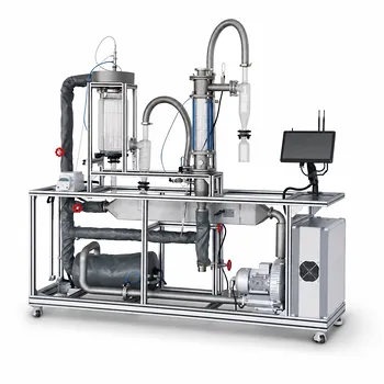
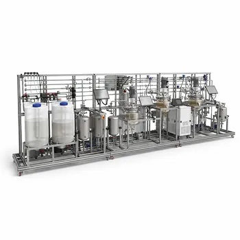
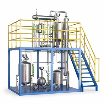
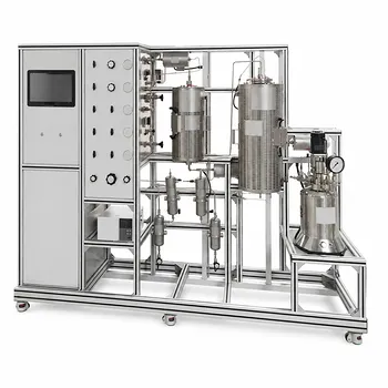
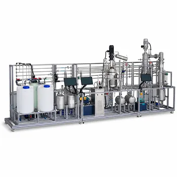
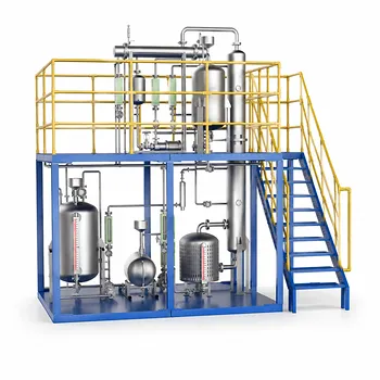
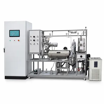
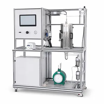
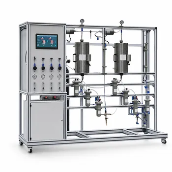
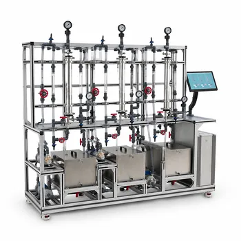
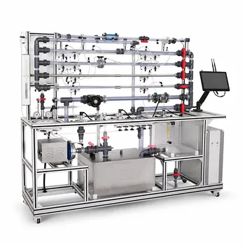
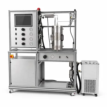
Implementing advanced multivariate analysis requires high-quality, reliable systems. LABPARK provides premium Educational and Vocational Unit Operations Pilot Plants across chemical engineering, bioprocess & biotech, and environmental & water treatment.
Engineered for universities, research institutes, and enterprises, our pilot plants offer the precise sensor integration and data reliability needed to master real-time process monitoring.
Ready to upgrade your lab or training facility? Contact us today to explore how LABPARK can support your educational and research goals.
Related Products
- Multi-Functional Drying Educational Unit Operations Pilot Plant
- General Purpose Cosmetics Production Unit Operations Training Pilot Plant
- Dual-Mode Rectification Pilot Plant for Practical Training Unit Operations
- Multi-Reactor Educational Pilot Plant for Reaction Engineering Unit Operations
- Multimodal Absorption and Desorption Pilot Plant for Unit Operations Training
People Also Ask
- How to study gasification in pilot plants? Compare exit gas composition & efficiency
- Why Use PTFE & Hastelloy in Chemical Pilot Plants? Prevent Corrosion & Ensure Safety
- How do deviations in estimating latent heat impact pilot plant thermal systems? Avoid hardware mis-sizing.
- Why is the chemical plant startup schedule crucial? De-risk scale-up with pilot plants.
- When to transition from PID to adaptive control in pilot plants? Key process indicators.