An early signal in your tracer data is the fingerprint of a problem. By injecting a tracer—a non-reactive chemical or conductive salt—into your pilot plant reactor feed and recording its concentration at the outlet, you immediately get a truth serum for what’s happening inside. Comparing the resulting residence-time distribution (RTD) curve, escape probability plot, or intensity function against the theoretical curves of an ideal reactor lets you visually and quantitatively diagnose bypass, channeling, or dead zones, often within minutes of acquiring data.
Tracer experiments turn a black-box reactor into a transparent system. The secret is not just collecting an RTD curve, but knowing which metric to interrogate: an early peak on the E-curve or an intensity-function spike screams “bypass,” while a longer‑than‑expected mean residence time points to stagnant volume. Cross‑checking at least two diagnostics—like the escape probability’s linearity and the intensity function’s shape—gives you a bulletproof diagnosis.
Why Non‑Ideal Flow Sabotages Your Results
Even a beautifully designed pilot plant reactor rarely behaves like textbook plug flow or perfect mixing. Bypass (short‑circuiting), dead zones, and channeling all steal away true residence time, which directly reduces conversion, skews kinetic data, and makes scale‑up predictions dangerously unreliable. If you don’t see these flaws during pilot‑scale work, the full‑scale plant will inherit them at enormous cost. Tracer experiments give you the only direct window into that hydrodynamic reality.
The Quiet Cost of Ignoring Flow Maldistribution
When fluid takes a shortcut from inlet to outlet, it spends far less time in the reactive zone than intended. The result is a fraction of the feed leaving under‑converted, while the rest over‑stays in stagnant pockets. The overall reactor output no longer matches the simple mathematical models you used to size the equipment, and your kinetic parameters become contaminated by flow artifacts. Tracer tests isolate these hydraulic failures from the chemistry, so you know whether to fix the agitator, the distributor, or the packing.
The Tracer Experiment: Your Diagnostic Toolkit
The procedure is straightforward but demands careful execution. Inject a tracer (pulse, step, or periodic) at the reactor inlet, and use inline conductivity or spectrophotometric sensors to measure the concentration‑time response at the outlet. From that raw data you can compute not just one, but several interlocking diagnostic functions.
The E‑Curve: The Heart of the Story
The residence‑time distribution (E(t)) is simply the normalized impulse‑response curve. It tells you the fraction of material that spends exactly time (t) inside the reactor. In a perfect plug‑flow reactor, the E‑curve is a sharp spike at the space time; in an ideal continuous stirred‑tank reactor (CSTR), it decays exponentially. When you see a distinct early hump or peak ahead of the main body of the curve, you’re witnessing bypass or channeling. Multiple peaks indicate internal recirculation loops. These signatures are so clear that even a quick visual inspection often points to the culprit.
The Escape Probability Method: A Straight‑Line Witness
One of the most elegant, yet underused, diagnostics is the escape probability plot. If you compute the cumulative distribution (F(t)) and then plot (\ln\bigl(1-F(t)\bigr)) against time, an ideal CSTR gives a straight line with constant slope. Any deviation is a smoking gun: a concave‑up deviation early on (a “dog‑leg”) signals a fraction of fluid escaping prematurely—classic bypass—while a delayed curve that sags below the line indicates fluid trapped in stagnant zones. Because the human eye is good at spotting non‑linearity, this method often surfaces subtle problems missed on a raw E‑curve.
The Intensity Function (\Lambda(t)): An Instantaneous Risk Detector
Your primary reference highlights the intensity function (\Lambda(t) = E(t)/\bigl(1-F(t)\bigr)) as a powerful comparator. For an ideal CSTR, (\Lambda(t)) is constant and equal to (1/\tau). Plot your experimental (\Lambda(t)) against that flat theoretical line, and any spike at low (t) immediately quantifies the heightened “escape risk” of fluid taking a shortcut. A decaying tail after the spike points to slower‑moving fluid in a dead zone. This direct overlay makes it simple to separate a mechanical bypass—like a faulty dip‑tube alignment—from a hydrodynamic short‑circuit due to insufficient turbulence.
How to Spot the Signature of Bypass and Dead Zones
Instead of trusting a single curve, combine these three diagnostics to triangulate the problem. Each gives a slightly different view, and together they make your diagnosis robust even in noisy data.
The E‑Curve: Early Peak and Shoulder Analysis
Start with the raw E‑curve. If you see a small extra peak arriving well before the main pulse, it’s virtually always a bypass stream. Measure the area under that early peak to estimate what fraction of the feed is short‑circuiting. When the main peak is broadened but appears later than the theoretical space time, stagnant volume is holding onto tracer and releasing it slowly.
Escape Probability: The Linearity Litmus Test
Draw your (\ln(1-F)) versus time. If the plot remains beautifully linear, your stirred tank is mixing ideally—congratulations. If the early points curve upward, bypass is at play; if a sharp kink appears later, you may have a stagnant region that fully flushes only after a delay. Because this test is independent of the tracer’s absolute concentration calibration, it’s remarkably tolerant of sensor drift.
Intensity Function vs. Ideal CSTR: The Definitive Comparison
The primary reference’s approach shines brightest here. Compute the theoretical CSTR intensity function (which is just a horizontal line) and overlay your experimental (\Lambda(t)). A prominent spike at (t < 0.2,\tau) is a direct measure of bypass intensity. The spike’s width indicates whether the shortcut is a narrow jet or a broader maldistribution. This method also lets you adjust operating conditions—like increasing stirrer speed or adding baffles—and watch the spike shrink in real‑time until the curve flattens.
Understanding the Trade‑offs and Pitfalls
Tracer experiments are not magic. They work only when you respect their limitations and avoid common misinterpretations.
Tracer Selection is Not Trivial
Your tracer must be completely inert, non‑adsorbing, and detectable at low concentrations. If it reacts or adsorbs on packing, the RTD becomes a convoluted mess of reaction kinetics and hydrodynamics, and you’ll misdiagnose a chemical tail as a dead zone. Always run a blank with no catalyst or a fully inert bed to confirm pure hydrodynamic behavior.
Sensor Placement and Injection Artifacts
A concentration probe mounted too close to the outlet can see vortex‑shedding noise that masquerades as bypass peaks. Similarly, a pulse injection that isn’t truly instantaneous smears the E‑curve and hides early bypass features. Always verify that your injection duration is less than 5 % of the expected mean residence time, and place sensors far enough downstream to allow cross‑sectional mixing.
One Curve Can Lie
A single diagnostic—say, an E‑curve with a shoulder—can look like bypass but actually be caused by a fast recirculation eddy near the outlet. That’s why you must cross‑reference with the escape probability or intensity function. If the (\ln(1-F)) plot remains linear early on, the “bypass” is likely just a localized velocity fluctuation, not a true hydraulic shortcut. Using only one tool risks spending a week fixing a non‑problem.
Stagnant Volume vs. Slow‑Moving Fluid
A shift in the mean residence time relative to the space time usually signals dead volume. However, a highly viscous fluid or gas‑liquid maldistribution can create a slow‑moving film that mimics a dead zone but still participates in reaction. In such cases, combine your tracer RTD with a chemical conversion measurement to decide whether the “stagnant” region matters.
Making the Most of Your Pilot Plant Tracer Experiment
Your choice of diagnostic method depends on what exactly you need to achieve during your lab session or research campaign.
- If your primary focus is to detect and quantify bypass: Start with the intensity function (\Lambda(t)) overlay against the ideal CSTR line. The early‑time spike gives you both a visual flag and a numerical bypass fraction. Complement it with the escape probability plot to confirm linearity elsewhere.
- If your primary focus is to measure stagnant volume: Compare the experimental mean residence time (first moment of the E‑curve) to the theoretical space time (V/Q). A significantly smaller mean residence time is the most direct proof of fluid‑starved regions. Cross‑check with the late‑time tail of the E‑curve.
- If your primary focus is to teach reactor hydrodynamics visually: Use the E‑curve and the escape probability line simultaneously. Students instantly grasp bypass from an early burst of tracer, and the curved (\ln(1-F)) plot makes ideal versus real mixing tangible.
- If your primary focus is to scale‑up with confidence: Use all three metrics to create a hydrodynamic baseline. Only when the intensity function is flat and the escape probability is linear does the pilot plant truly represent the idealized model you intend to scale, ensuring your kinetic parameters are clean.
The power of tracer experiments lies not in a single number, but in the story told by multiple diagnostic plots working together. Learn to read that story, and you’ll never again guess what’s happening inside your reactor.
Summary Table:
| Diagnostic Method | Bypass Indicator | Dead Zone Indicator |
|---|---|---|
| E-Curve | Early peak or shoulder | Delayed peak & long tail |
| Escape Probability | Concave-up deviation (early) | Curve sags below linear trend |
| Intensity Function | Spike at low t (t < 0.2 of space time) | Decaying tail after the spike |
Build Next-Gen Chemical Engineering Labs with LABPARK
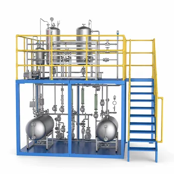
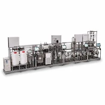
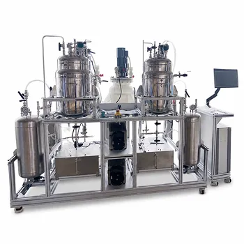
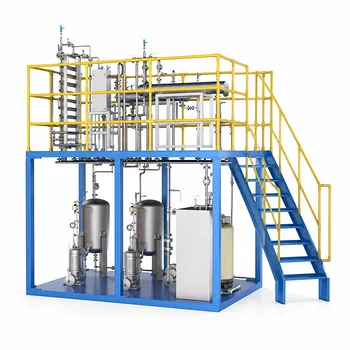
Bridge the gap between theory and practice with LABPARK’s premier Educational and Vocational Unit Operations Pilot Plants. Designed for universities, research institutes, and enterprises, our state-of-the-art pilot plants in chemical engineering, bioprocess & biotech, and environmental & water treatment provide students and researchers with hands-on experience in diagnosing real-world reactor behaviors like bypass and non-ideal flow.
Ready to elevate your training and research capabilities? Contact LABPARK today to find the perfect pilot plant system for your institution!
Related Products
- 100L Continuous Loop Hydrogenation Educational Unit Operations Pilot Plant
- Crude Benzene Hydrogenation Educational Unit Operations Pilot Plant
- Multi-Reactor Educational Pilot Plant for Reaction Engineering Unit Operations
- Fixed Bed Gas Solid Catalytic Reaction Educational Pilot Plant
- Micro-Scale Gas-Solid Catalytic Reaction Educational Pilot Plant
People Also Ask
- How do pilot plants overcome mass transfer limits in hydrogenation? Scale Up with Confidence
- Why is the chemical plant startup schedule crucial? De-risk scale-up with pilot plants.
- How can chemical engineering students use unit operations pilot plants to study kinetics? Master reactor scale-up!
- Why are particle density, bulk density & voidage critical in pilot plants? Master Bed Fluid Dynamics
- Why Does a Pilot Plant Solver Return a Singular Matrix Error, and How Can You Resolve It?